Visit Link
Tag: Responsive Design
A well-functioning pattern library is a beautiful thing. It is a powerful resource that you and your entire team can use to efficiently create consistent user experiences for your website or service. It cuts out repetitive design work, allowing you to focus your energy on creating new user experiences; and it creates a common UI […]

This bookmarklet allows you to retrofit any site with a responsive design.
HTML Responsive Images Extension
This proposal adds new elements and attribute to [HTML5] to enable different sources of images based on browser and display characteristics. The proposal addresses multiple use cases such as images used in responsive web designs and different images needed for high density displays. http://dvcs.w3.org/hg/html-proposals/raw-file/tip/responsive-images/responsive-images.html
Responsive web design creates a new set of development demands. How should we best implement complex sites to load quickly and meet the needs of a wide range of devices? Scott Jehl joins Jen Simmons to talk about the South Street toolset and other Filament Group discoveries of best practices. Link

If you don’t know who Zurb is then I highly recommend that you head over to their website and check out the Foundation 3.0.
Today they posted about sharing ideas…
Responsive Web Design Resources

We built the website Responsive Web Design because there was a lack of centralised resources for web developers that wanted to learn more about Responsive Web Design.
When ever you are testing responsive design sites across multiple devices you need rotate the device. Sometimes doing this means that you’re layout/design is zoomed in more than the normal size.
SEO and Mobile vs Responsive Web Design
At the moment I’m monitoring mentions about “Responsive Web Design” on google alerts to continue to post the relevant content on Responsive Web Designs and compile it for a new website I’m building that contains a series of resources on #RWD.
This morning I came across this article, For Mobile SEO Ask “What Do Mobile Searchers Need?”, and couldn’t help but post a comment.
Responsive Design

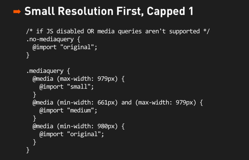
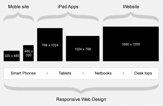
Responsive design has taken the world by storm over the past 12 months as more and more devices are being released and browsers are adding more and more capabilities for CSS, and in particular the @media queries in CSS3.