There has been a lot of talk around Mark Zuckerbergs comments on html5. As usual the Internet has taken the comments somewhat out of context…. And by somewhat I mean hugely.
This is what Mark actually said.
When I’m introspective about the last few years I think the biggest mistake that we made, as a company, is betting too much on HTML5 as opposed to native … because it just wasn’t there. And it’s not that HTML5 is bad. I’m actually, on long term, really excited about it. One of the things that’s interesting is we actually have more people on a daily basis using mobile Web Facebook than we have using our iOS or Android apps combined. So mobile Web is a big thing for us.
At the moment I’m monitoring mentions about “Responsive Web Design” on google alerts to continue to post the relevant content on Responsive Web Designs and compile it for a new website I’m building that contains a series of resources on #RWD.
An interesting article with some good points, however you don’t seem to have looked into every aspect of the problem.
First off, I agree that ideally an adaptive approach is best for anyone with an online presence. By adaptive I mean you have both mobile and responsive sites for the potential customer to access.
Unfortunately sometimes maintaing multiple sites with multiple content is difficult. I’ve worked for some very good CMS providers that allow content to be shared between the full and mobile dedicated sites, however it is still a reasonably large overhead for website owners to steer down only one path.
Of course if you’re in the top 100 forbes companies then sure go for it, but for the smaller businesses it is sometimes just out of their reach.
Having said that you’re article seems to focus largely on the use of mobile with search, however you don’t cover the context of the mobile search. Were they on the bus, in the car, sitting on the couch, lying in bed, passing time on the toilet? Each location offers a different context as to the type of content that the user is looking to get.
It’s not enough to just direct mobile users to a cut down version of the site. Doing this is punishing users for using mobile devices.
As I mentioned above ideally you have two sites running, your full website and a cut down, fast loading, transaction focussed mobile site that contains the option to return to your full website (and remember the selection). And what happens when they arrive on the full website? That’s right, it responds to the best possible layout for the canvas that it is being viewed on.
A question for you:
At the end of the day is it better to have a site with great onsite SEO, or is it better to have a site that gets tonnes of linkbacks because it provides an awesome experience?
There is a lot of thought that needs to go into your online strategy, especially when it comes to implementing a growing trend of web design and layouts.
If you’re thinking about updating your website design, or looking to make your existing design responsive then get in touch and we can work out the best possible solution for your online presence.
With all the new changes to the Facebook Page Timeline Amy Porterfield decided to run a webinar to discuss the elements that have changed and how you can use these changes to benefit your business or your clients business.
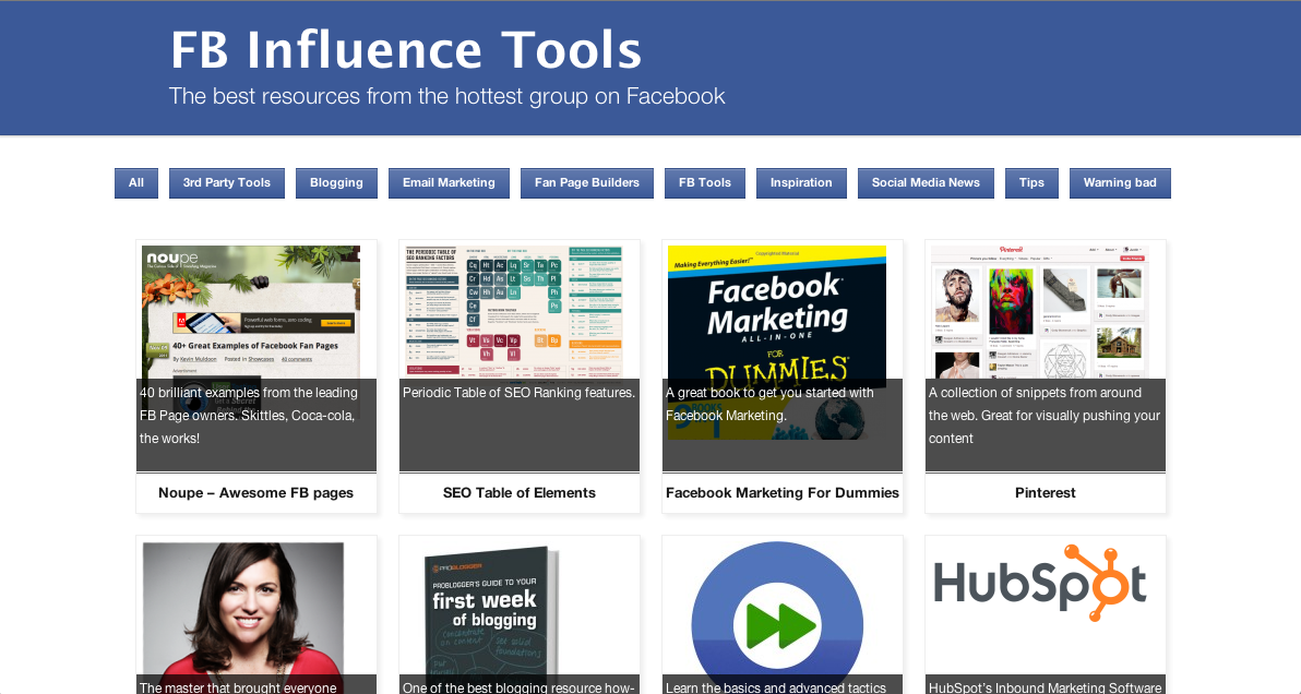
So sit back and enjoy how this webinar unfolded. (Keep refreshing to find out more).
Amy introduces and asks us to tweet using #fbwebinar
The webinar is being recorded, it will be distributed in 24 hours and you can download the slides afterwards as well.
Today we will learn…..
Overview of the Changes
Details – Timeline, Apps, Admin, Insights
Mindset Shift: From likes to leads
Smart Strategies to benefit from the changes
Engagement Tips to Exapand on the Conversation
Tools and Services to Support your strategies
It’s no longer about the number of likes
Details – Timeline, Apps, Admin, Insights
Timeline Cover Photo
Specs for cover image: 851 x 315 pixels
Specs for profile image: 180 x 180 pixels
Restrictions for timeline cover
No price or purchase information
No web address, email, information
No referencing of Share or Like features
No calls to action
No promotions, coupons, ads
Not primarily text base, or infringe on copyright
We will look at pushing the boundaries of the last 2.
Strategies for timeline cover image
Social Fresh is doing some great stuff. Nice image, clean and simple.
Captain Morgan USA: Expand your brand, create the promotion. Check the bottle in the profile image.
Amy Porterfield: (there is no way this should be allowed). Amy stayed away from arrows or any call to action text. There is an image there, but this is pushing the limits (beyond in my opinion).
Amy used the cover image to relate to one of the Facebook Page Apps
Spark Curiosity: Beautiful use of imagery
Dove: Highlight your Audience
Chevrolet Colt: Highlight Unique Features
Amy Porterfield: Personal Branding. Use your name, pic and explain what you do.
Ad Age: Spotlight your content. Use some of your content in your cover image.
We think that Facebook are looking for you to change this frequently to keep your page fresh.
Custom Apps
TAbs are now called Apps
Specs: 810px wide (don’t put your hold site there, but you COULD)
Reveal tab/Like gating functions still work (if you like it you can present different content)
Thumbnail for Apps
Amy shows how you can pull through blog posts into your tab. At the end of these pages you should always include a call to action to sign up (or something else).
Amy looks at Molly Cools page app to show how you can include Facebook Comments at the bottom of the custom tabs. This allows you to draw traffic directly to these apps.
Specs for Thumbnail – 111 x 74 px
No thumbnails for facebook apps
You can have up to 12, they can be moved around
Strategies for thumbnails
Create a reason to click on the thumbnail
Get strategic with the 3 apps above the fold
Rename the app itself in terms of action
You could show you likes, but it’s not advised because you can get better use out of something else.
Amy shows her tabs to show….
be clear and use words not images in your thumbnails
change the name of your app so it is a clear CTA (Sign Up! Watch! Enroll Now!
Great example of a school that uses thumbnails to promote the school and provide additional content.
If you want to change the order of the thumbnail/apps you can click on the little pencil (hover over the app) and then choose where to move it.
To update the thumbnail, hoever on the app, click on the pencil, select edit settings, Change the Custom Tab name, click on Change for the Custom Tag image, upload the thumbnail and you are away…..
No default landing tab
No longer set a default welcome tab
You can use the unique URL directly to the custom app to drive traffic
Supercharge your traffic with Facebook Ads
Lack of the default tab makes it harder to get users to your best FB pages. Facebook ads allows you to now drive this traffic (and Facebook makes a tidy profit). Amy shows an example on how to run an ad to point customers towards the latest blog post that she showed us before.
If you’re running ads for your current customers (current likes) then direct them to your custom apps to keep them in Facebook.
Amy runs through setting up the Facebook Ad using internal pages.
Use the new features to ramp up your engagement
First impressions really matter
More eye catching images
Use videos – create short videos to build trust and authority
Ask fun interesting questions
Don’t post and ditch, make sure you stick around
There are some new changes to how fans contribute to your pages. On the right of the page shows the most recent comments but you can click on See All to view them all.
The new Admin Panel is on the top right, this is where you can get more out of the changes.
You can see the New Likes. Each day go in and choose some people to click through to their pages and make a comment on something on their page. Don’t say “thanks for liking”, but try and connect/engage with them.
New Messaging Features
Users intiate messages, admins can not start them
non fans can send messages to page admins
Go to Admin – Manage – Edit Page – Manage Permissions – here you can switch the messages on and off (see the last option)
Highlighted Posts
Highlighting posts (click on the star in the upper right corner of the post) will extend the post across the full width of the timeline. Do this as a strategy for your most important posts. Check out Social Identities for more information on how to work this. (I think this is a bad example because he’s “hightlighted” a post to drive traffic to the top apps, but as we know it can’t be pinned to the top)
Pinned Posts
Pinned posts allow you to feature your most import content. It stays at the top for 7 days. You can actually TARGET LOCATIONS when you pin a post…. for example you might want to Pin something for your Australia fans only.
Larger Story Layouts
This is the ability to use images to be more visually appealing to your Fans or potential likes.
Milestones
Add milstones to showcase what happened in your past
Link to the product/antoher page from the milestones
Include Large beautiful imagery
Milestones stretch full with
About Section
Varies by category
Keep it around 165 characters
If you’re a local business the about is default. You can show hide things but only from the about section (remove phone number to get your web address)
ALWAYS include a link within the About Page
Use it as a CTA, change it up often because it is prime realestate
Admin Panel
Admin – Manage – Activity Log – mouse over the right corner to highlight posts from fans.
Insights – click on see all to find everything
If you go to any facebook page, go to the like app and you can see their insights. Great way to gauge how you are going against your competition.
5 Quick Timeline Strategies
Create calls to action with your thumbnails
Be strategic with the 3 apps across the top
Quality interactions vs more likes
Make your timeline visually appealing (while invoking real action)
Use Facebook Ads to drive traffic to your apps
Special Guest Time
Nathan from Lujure is on to market his service. (Lujure looks clunky, looks good, but clunky).
Go to www.timlineapp.co and the first 20 people will get timeline app builder will get Amy Porterfield review the app/page and send you a video.
The webinar just went sales based. It was like a 15 minute infomercial for Lujure. Really just not needed.
A few months ago I decided to expand on my Facebook knowledge through a training packaged developed by Amy Porterfield.
While the majority of the $97 course was information that I was already aware of there were a few key areas that I had not previously considered which I was able to work on to improve the Facebook interactions of a few of our clients.
Unfortunately this led me down the path of a mechanics car, where I don’t get to do as much on my own Facebook site.
Facebook Influence Tools design
The inspiration behind the layout of the site came from a few different areas. Facebook itself has an influence over the colours, the font and the header sections as well as the category tabs. I wanted it to have the Facebook look and feel seeing as it was all about the Facebook.
The grid layout inspiration comes from Nerdi.org and Pinterest. It’s also an easy way to evenly layout the different options without showing any prioritisation to the particular areas.
CMS & Development Tools
WordPress was used to create the site mainly because the possible contributors (Amy Porterfield) already knew how to use the product….. and that it was easy to set up.
Unfortunately the categorisation and tags that come with WordPress are not as easy to apply in this situation, so a bit of development work was required around listing the Categories as links (the sorting menu on top) as well as listing all of the categories as part of the individual posts for sorting.
Smush.it was used to optimise the images and W3T Cache was used to improve the performance.
Reverie theme (based on the ZURB Foundation template) was the CMS theme basis, a very simple theme that you can start off with any project.
If you think this is something that you might want as a site or even include as part of your existing site then get in touch.
I’ve been doing a bit of work lately trying to improve the production value of the Facebook pages that I manage as well as putting my clients on the right track with their Facebook landing tabs.
The first thing you see when you land on someone’s Facebook page is their landing page.
You know the ones.
They show you a glimpse of what the company/business offer and ask you to Like their page…. often with the promise of wealth/fat loss or, like mine, free information.
[two_third]
Too often though I find myself waiting more then a couple of seconds for someones Facebook landing page to load.
I treat this in the same way that I treat a regular website that is taking too long to load…. I click away to another page.
Just because the Facebook page landing tab is seen on the Facebook site, it is still apart of your brand and you should be doing as much as you can to ensure that the content is loading as quickly as the content on your own site.[/two_third]
[one_third_last][box type=”shadow”]If you’re not already concerned about your sites speed you should read about how it affects Google SEO rankings, how even a fraction of a second can cause a loss in customers and sales, and then get a hold of Page Speed and YSlow and drive those times down. If you’re too lazy, get in touch with me.[/box]
[/one_third_last]
Putting this extra effort into improving the load times will avoid users, just like you and me, clicking away. By avoiding this you increase you brand awareness and PROFIT$.
Creating a Facebook Page Welcome tab
There are lots of different ways that you can do this. The most popular way that I have found people using is using an exisiting Facebook App to help you create and host the pages for you.
Alternatively if you’re feeling adventurous, you could code and create your own Facebook tab which will give you a lot more control over things like performance, but if you want the more fancy features it will begin to mean you need more programming skills.
The most basic thing I learned is something that I’ve already included in the beginning of the post. Your Facebook page tab should be created with the same performance rules you would use for the rest of your website.
Some of the cooler things that I learned, and you should keep in mind are….
While Amazon S3 was the best performance OUTSIDE of the Facebook page it returns an error when you use it in Facebook. The error is “Method Not Allowed” “The specified method is not allowed against this resource”. The reason you get this back is because Facebook is pulling the content through an iFrame and for some reason uses a POST to retrieve the content. Unfortunately Amazon only accepts GET requests at the moment… even with the Bucket rules added that Facebook supply to you.
If you are going to use images on your Facebook page landing tab then you should first upload them your page Wall or in a photo album and set them to public read. Then you simply use that URL to pull the image into your page (and you take advantage of Facebooks awesome CDN).
KISS – The old saying. Keep it as one document (no javascript or css files) and write all your CSS inline. If you must use pictures (and I think you definitely should) then host them with Facebook.
I’ve nested a video below for you to see how the load times went. There are a few caveats with these tests (grain of salt time).
You can see that the Facebook wrapper loads at different times, so the final time should take that into account
This was run a few times, each with very similar results, on a server located in the US via http://www.webpagetest.org. I couldn’t use the Video snapshots with any other server.
Oreo, Lujure and Coca-cola each showed progressive loading around the same time as the others were showing full content. This might be enough to keep you user put and not clicking away.
To wrap up….. this is just a test. Please check out the pages yourself and post back your experience with each of them. If anyone can do their own round of testing with the same pages please let me know the results.
Lauloves yoga is Laura Anderson… a yoga teacher who has set up in Darwin and teaches at three different locations within Darwin.
Laura has been using wordpress for a year but had grown out of the initial off the shelf theme that she had originally chose.
While the wordpress site was able to do everything that was required for her needs, it lacked character and personality to match her brand.
We sat down and discussed the kind of look and feel that Laura wanted for her site, and how the tone of the site should come across to her readers and students.
Armed with that knowledge I set to work first coming up with the logo design. Laura was happy with the first draft, however we had used the original Union Jack colours that created the wrong mood for the site.
We came up with the colour palette and applied this to the logo, and from there it all fell into place.
The site was rebuilt using tweaks to the Thematic theme, and continues to use WordPress as the CMS behind the scenes.
Page Templates
[one_half]
Home page with feature
[/one_half][one_half_last]
Inner Page with sidebar
[/one_half_last]
If you have an existing site and you’re looking to give it a bit of a face lift then contact us now for a free 30 minute consultation. If you after that you don’t think I’m the right person for the job you’ll still be 30 minutes more informed about what you need to do next.
One of the great things that Facebook has done over the years is giving us the opportunity to create Fan Pages (also known as Business Pages, or just Facebook Pages).
This had a duel benefit for Facebook users.
If you didn’t want your company or brand to be associated with your holiday snaps they could be completely separate
If you wanted to Follow a Brands message you didn’t have to put up with non related content
It also allowed users to collaborate together while still maintaining your own individual accounts.
The other benefit of the page was that Facebook allowed us to create a specific image for our Facebook pages, and it could be a lot bigger than our regular profile images.
So lets get into the details of the Facebook page image.
Dimensions
The image can be 180 x 540 pixels. This gives you a tonne of screen realestate to not only show off your funky brand, but also to convey quite a bit of extra information to you reader.
This leads us to the next element
Company Name
Include your brand name in the image as well. I know that sounds pretty obvious, but you would be amazed how many people get caught up with the design and forget to include the name of the buisness they’re trying to promote.
Sure, if you’ve got a world recognised brand then you can get away with it, however if you’re like the rest of us getting started you should keep the company name visible. It goes a long way to cementing your name and what you do into the readers sub-conscious.
Company URL
Although you won’t be able to click on the URL it’s the same theory as the company name. It’s no good if you have a potential customer that knows you are called Justin Avery Design but don’t know that you’re site is actually http://surfthedream.com.au . This is particularly important if you are in competition with domain names and there is .com, .com.au, .net, .org, .co.uk sites out there as well. You don’t want all this good work to go to your competitors do you?
What your business does
Again we are sure that you will have this covered with you post updates but people are drawn to this area so you should use it. Give people a sentence or a strapline telling them exactly what you’re all about.
Think “elevator” pitch but much much shorter. Maybe “broken elevator hurtling towards the ground” pitch.
What else?
That’s it. This will be a great start… and if you haven’t already done these things then chances are you should see some improvement on your fan base. Check out some examples below to give you a few ideas about what you can do, but please remember that some of these brands are already very established so stick with the guidelines.
Skittles Facebook Image
Victorias Secret
Social Media Examiner
Commonwealth Bank
Zappos Facebook Page
Justin Avery Web Design
Next Steps
We’ll be posting a few more articles around Facebook, Twitter and Google Plus marketing in the next few weeks so if you’re interested don’t forget to subscribe to our updates. If you’re looking for some immediate advice then contact me to organise an in person meeting or we can skype(@justincavery) or get together for a google hangout.
SurferM.ag is a wordpress based magazine site that has now been running since 2008. It features news and reviews about everything and anything that happens in the World of Surfing.
Since the inception we have developed the initial theme to inclue Full Page Live Streaming, Online Stores, Adsense and Affiliate Advertising.
We created a Category and Tag based Taxonomy to improve the related content options as well as improve the SEO Performance in a saturated market.
We ran Facebook and Google Adwords advertising campaigns to improve the user subscription numbers and reviewed the success of the campaigns through integrated Google Analytics.
The site took on live steaming of ASP Surf Competitions and we wanted to see the affect that had on user interactions in real time. We used GoSquared to monitor this and used the results to improve on the Twitter and Facebook conversations .
As a global site the performance (site load time) was a concern. We set up a Content Distribution Network (CDN) with Amazone S3 Services so that all file assets (images, CSS, Javascript) were downloaded from a local source. We also worked on a caching strategy to ensure browser caching was fullly untiliise without affecting the currency of the articles.
Katie is a young and fast rising star based in London. Katie understood that to make it in such a difficult environment she needed to take full advantage of the online tools available to her.
Katie Leamon Design was originally developed in Joomla by a design agency in London, however she found it difficult an clunky to use.
We took the existing design and improved many of the areas. We replaced images with text where appropriate, added the social elements of Twitter and Facebook, and improved the typography and visual hierarchy through out the site.
We also migrated the site across from Joomla to WordPress allowing the client to use their existing skills to keep the site up-to-date and content rich.
We used an existing WordPress Framework and made the appropriate customisations to allow multiple use of posts across different content requirements.
Surf the Dream is a blog that has been running since the mid 2000's when it started on BlogSpot. Over the years it's been rebranded as justinavery.me (now my resume) and JaveryDesign.com (which now redirects back to this site).