FlowingData — Read on flowingdata.com/2020/12/23/best-data-visualization-projects-of-2020/

FlowingData — Read on flowingdata.com/2020/12/23/best-data-visualization-projects-of-2020/
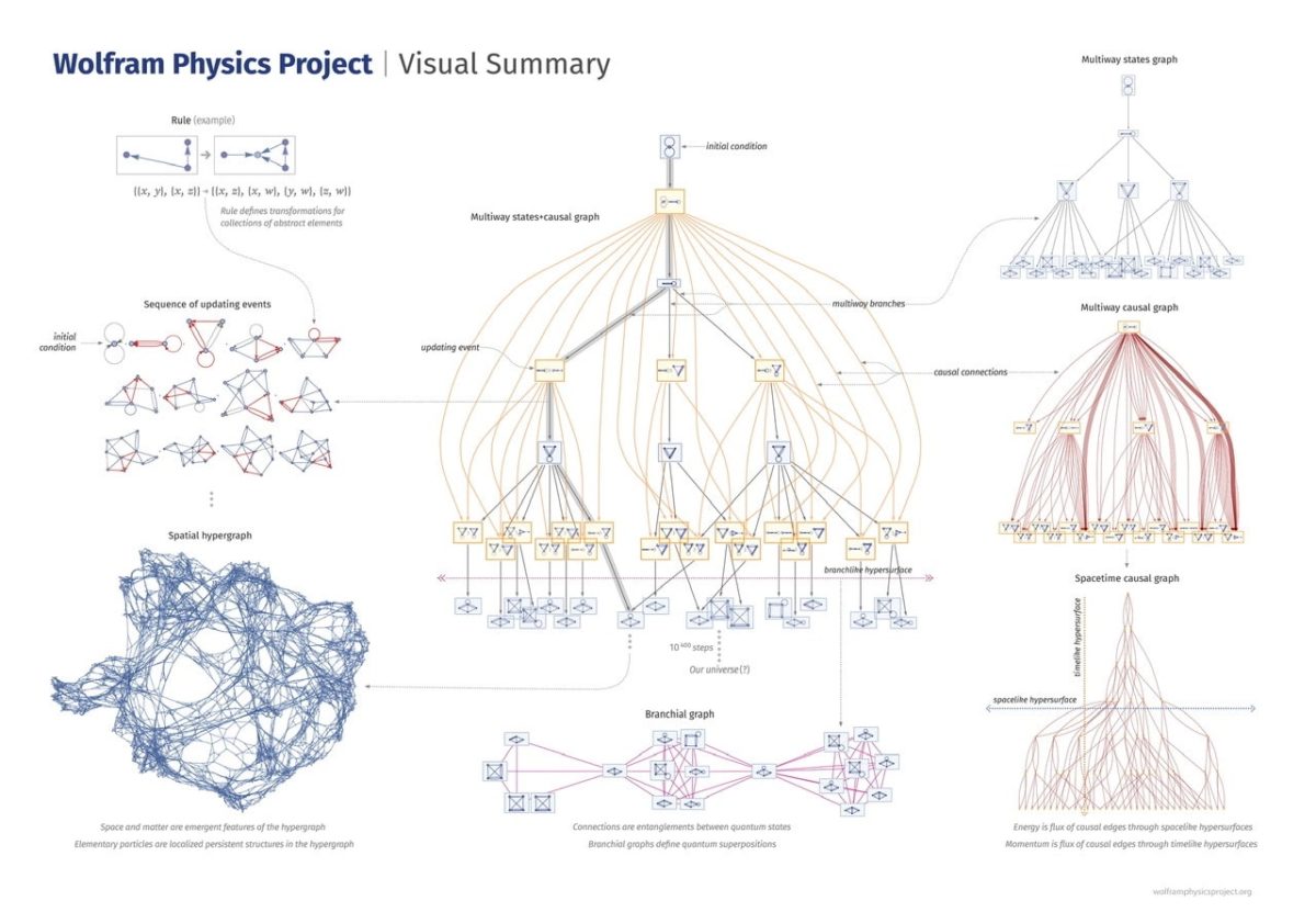
From rule to potential universe hypergraph, a visual representation of states and graph types. — Read on www.wolframphysics.org/visual-summary/
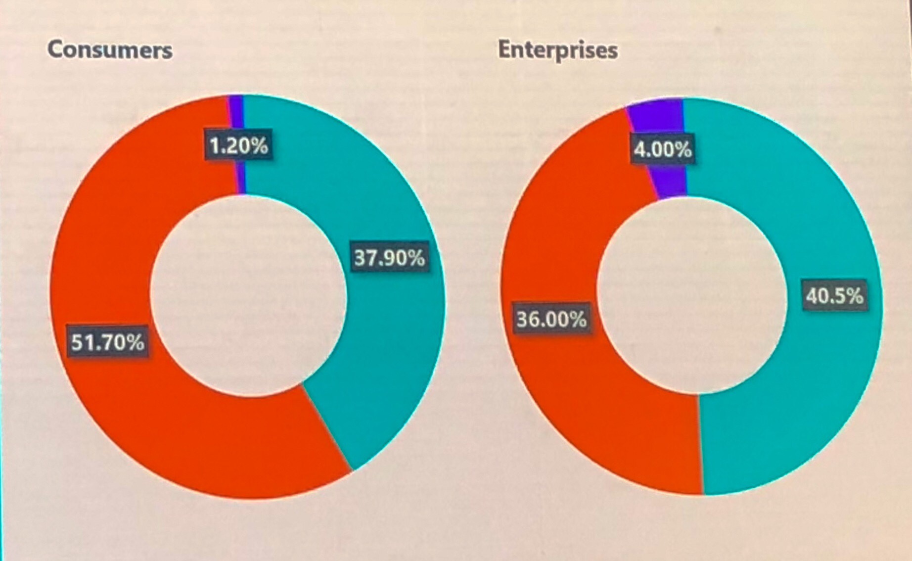
If your graphs don’t visually illustrate the percentages associated with them I literally stop listening to the point being made. It’s often not the speakers fault, and I don’t consciously stop listening up in my high horse, I just get so caught up in the inaccuracy that I can’t focus on what’s being said.
I love visualisations of any sort, but ones that show me how to live longer have to be a favourite. What could add years to your life? Why do women live longer than men? What’s the best method of life extension? Diet and exercise? Or polygamy and pets? Let the latest data decide. — Read […]
The D3 graph gallery displays hundreds of charts made with D3.js, always providing the reproducible code. — Read on www.d3-graph-gallery.com/
Create interactive, responsive charts with Datawrapper – no code or design skills required. — Read on www.datawrapper.de/charts/
This week we used this to illustrate the distribution of subscribers around the world. Visit Link
This is an awesome data visualisation to show the difference between gridlock and bottlenecks. A great use of D3.js and a beautiful design. Visit Link