Visualising data in presentations

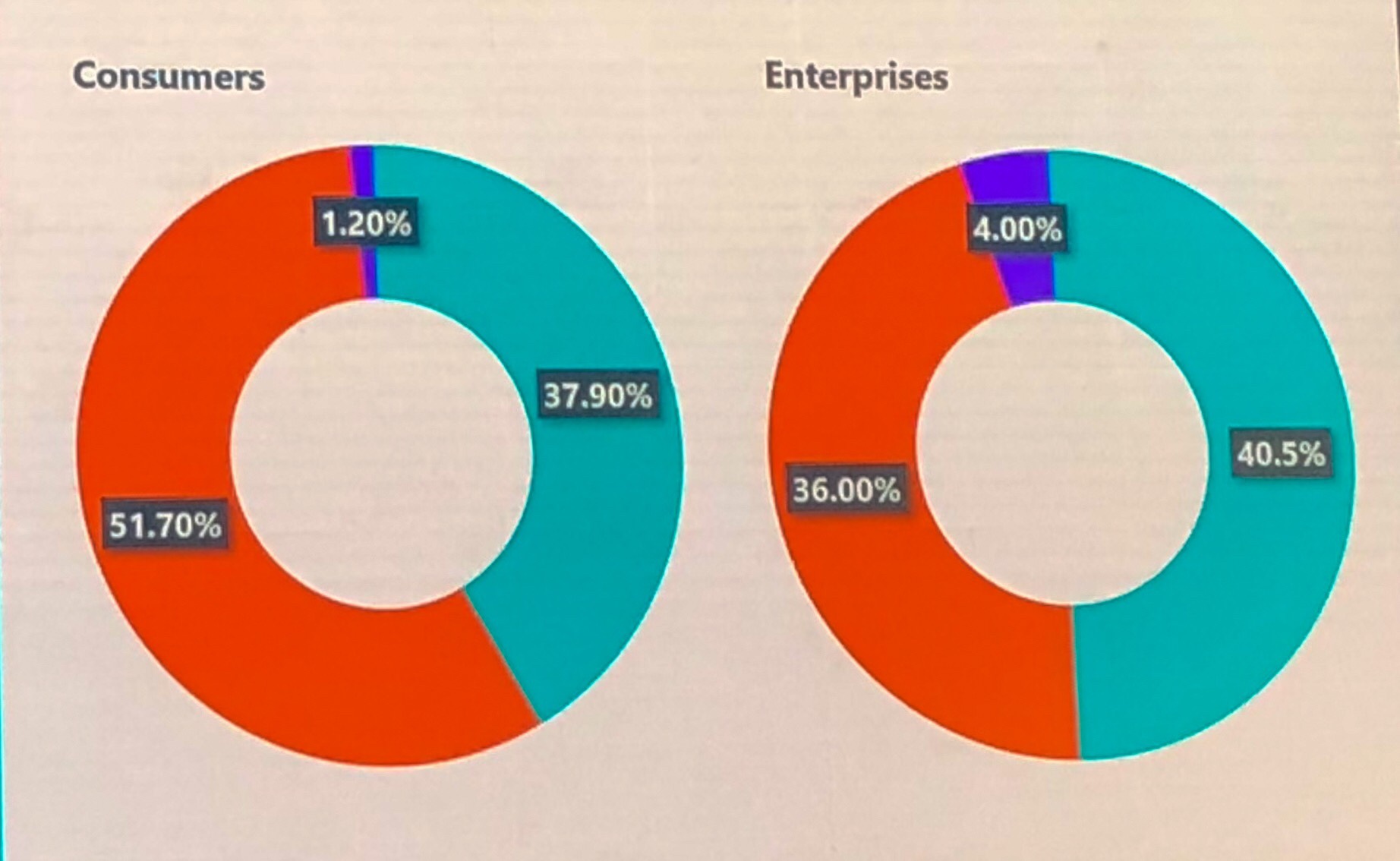
If your graphs don’t visually illustrate the percentages associated with them I literally stop listening to the point being made. It’s often not the speakers fault, and I don’t consciously stop listening up in my high horse, I just get so caught up in the inaccuracy that I can’t focus on what’s being said.

The Art of Innovation – Guy Kawasaki at Gartner Barcelona

1) Make Meaning… not money Make the world a better place. When you are building something ask yourself “is this making the world a better place?” 2) Make Mantra Most people come up with a Mission Statement. Most mission statements are developed through the following process. 50 senior employees have an off site week. This… Continue reading The Art of Innovation – Guy Kawasaki at Gartner Barcelona