
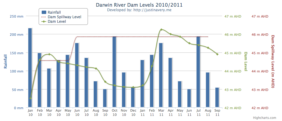
Power and Water Corporation provides power, water and sewage services to the Norther Territory, Australia. One of their most popular pages on their website is the Darwin River Dam graph page.
Unfortunately the Power and Water graphs, like a lot of the online graphs displaying data/information are only available through the use of excel and pdfs.
There is a better way.
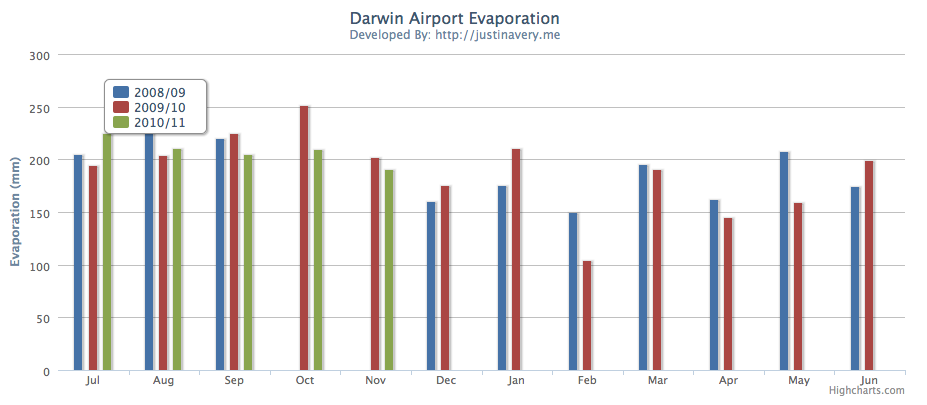
The examples shown below were created by us using the creative commons highcharts graph library to illustrate to the corporate communications department at Power and Water how they could provide dynamic information to their customers across multiple devices.
The advantages of this include
- Dynamic display of content
- Responsive to the device
- Shows your company is keeping up with technology
- Available without any downloads required
We only built two graphs to illustrate what is possible
and from there we are now working with Power and Water to build up the number of dynamic graphs to show water usage, power demand and overall cost of power across the Territory and Australia.
If you’d like to find out more about what we can help you and your business with then get in touch.
I believe you are not attributing the creator of the chart library correctly, someone who reads your page will be lead to believe that you have created the chart framework itself. Please have a read here.
http://librarycopyright.net/wiki/index.php?title=How_to_attribute_a_Creative_Commons_licensed_work
Regards
Hello fellow web designer.
You are absolutely right. I certainly am not the person that created the chart framework itself and no such claims are made on this article or the dev links.
I provided some clear attribution to the graphs on the graph pages themselves, and there are some clear links back to highcharts.
Still, I’m all for Creative Commons so I’ll make it a little more clear on this site as well.
Thanks for your feedback.
Justin
Bwaaaaaahahahaha!! Sorry… Just read the comments! Reminds me of the good old Peppermint V Spearmint days..
A quality blog in it’s time. I think we should plan for it to make a reappearance.