I’ve been working on a sales dashboard for work that highlights the number of sales, number of meeting, contribution to the overall targets and a few other things that make a member of the sales team proud they’re hitting their targets.
The layout requirements I had for this part of the dashboard was
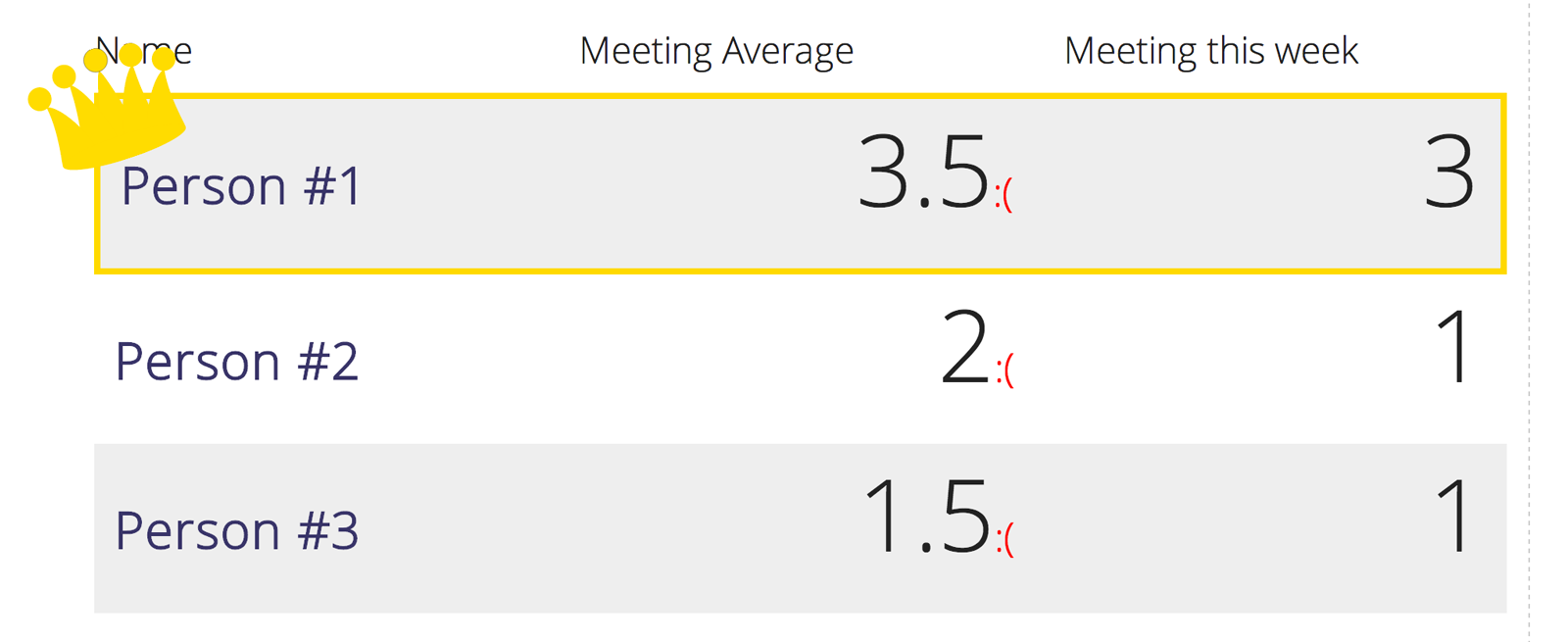
- Zebra background to differentiate rows.
- Gold Border around the top performer
- Golden Crown sat upon the top performer
Here’s what we’re after….
Zebra background with pseudo selectors
The zebra background is done through the use of the nth-child approach.
.sales-team:nth-child(2n) { background: #eee;}
What we’re doing here is saying we want to select the element with the style .sales-team and then for every second element, (2n), we should add a background: #eee;. That’s that problem sorted.
The next part is getting the golden border and the crown to appear.
Psu, psu, psuedo
This is where we apply a border and the crown on the first element.
The border can be added by selecting the :first-of-type pseudo element.
.sales-team:first-of-type { border: solid 5px gold;}
The next requirement is to add the crown as a background image. Now I wanted this to sit on the top corner of the first row so that it spills out of the container on the angle.
To accomplish this I wanted to add a :before pseudo element and use that as the background image for positioning, but I needed it to run on the same :first-of-type element.
Fortunately you can daisy chain pseudo elements together so I ended up with
.sales-team:first-of-type:before {
    content: '';
    background-image: url(../images/crown.svg);
    background-repeat: no-repeat;
    background-size: 75%;
    position: absolute;
    width: 150px;
    height: 150px;
    top: -45px;
    left: -40px;
    -webkit-transform: rotate(-18deg);
    -moz-transform: rotate(-18deg);
    -ms-transform: rotate(-18deg);
    -o-transform: rotate(-18deg);
    transform: rotate(-18deg);
}
The above code we are selecting the first element with :first-of-type, and then creating a :before pseudo element to contain the Crown.SVG file. This hook is then used to position the background image on the top left side of the element a rotate the crown.
The result is something that works quite nicely and cheers up the sales team, or at least the one at the top of the table.