One of the great things that Facebook has done over the years is giving us the opportunity to create Fan Pages (also known as Business Pages, or just Facebook Pages).
This had a duel benefit for Facebook users.
- If you didn’t want your company or brand to be associated with your holiday snaps they could be completely separate
- If you wanted to Follow a Brands message you didn’t have to put up with non related content
It also allowed users to collaborate together while still maintaining your own individual accounts.
The other benefit of the page was that Facebook allowed us to create a specific image for our Facebook pages, and it could be a lot bigger than our regular profile images.
So lets get into the details of the Facebook page image.
Dimensions
The image can be 180 x 540 pixels. This gives you a tonne of screen realestate to not only show off your funky brand, but also to convey quite a bit of extra information to you reader.
This leads us to the next element
Company Name
Include your brand name in the image as well. I know that sounds pretty obvious, but you would be amazed how many people get caught up with the design and forget to include the name of the buisness they’re trying to promote.
Sure, if you’ve got a world recognised brand then you can get away with it, however if you’re like the rest of us getting started you should keep the company name visible. It goes a long way to cementing your name and what you do into the readers sub-conscious.
Company URL
Although you won’t be able to click on the URL it’s the same theory as the company name. It’s no good if you have a potential customer that knows you are called Justin Avery Design but don’t know that you’re site is actually http://surfthedream.com.au . This is particularly important if you are in competition with domain names and there is .com, .com.au, .net, .org, .co.uk sites out there as well. You don’t want all this good work to go to your competitors do you?
What your business does
Again we are sure that you will have this covered with you post updates but people are drawn to this area so you should use it. Give people a sentence or a strapline telling them exactly what you’re all about.
Think “elevator” pitch but much much shorter. Maybe “broken elevator hurtling towards the ground” pitch.
What else?
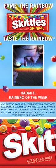
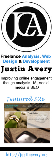
That’s it. This will be a great start… and if you haven’t already done these things then chances are you should see some improvement on your fan base. Check out some examples below to give you a few ideas about what you can do, but please remember that some of these brands are already very established so stick with the guidelines.




Next Steps
We’ll be posting a few more articles around Facebook, Twitter and Google Plus marketing in the next few weeks so if you’re interested don’t forget to subscribe to our updates. If you’re looking for some immediate advice then contact me to organise an in person meeting or we can skype(@justincavery) or get together for a google hangout.