Eighteen months ago I put together a very crude webpage that used iFrames to preview a few of the popular viewports as a quick and dirty test for a responsive project we were working on.
There were plans to improve the tools to something with quite a bit of sophistication, but with time constraints in addition to a plethora of similar tools becoming available I put it back on the shelf labeled “The projects that never were”.
I never really needed this tool again. All my final testing was done on devices, and in the early stages using Media Queries (by Spark Box), dragging the chrome window. That was, at least, until a Thursday night in early February.
After spending a couple of hours putting together the responsive design newsletter it was all ready to go once I added the feature site image to the top of the newsletter. To do this I would open up safari and resize the browser from 1600px to 1280px, 768px, 320px and take screen shots at each point. I would then import those shots to Photoshop and position it within some pre canned browser chrome images (iMac, macbook, iPad and iPhone). Once that was done I’d export it to the web, run image optim and upload it to the newsletter. The whole process would take 15-30 minutes depending on distractions.
It’s not just the weekly newsletter I need them for either, it’s also website reviews for new responsive designs, visual aids for presentations, feedback for clients on their designs…
So after the newsletter went out on Friday morning I opened up the laptop and started building a responsive design testing tool.
Am I Responsive?
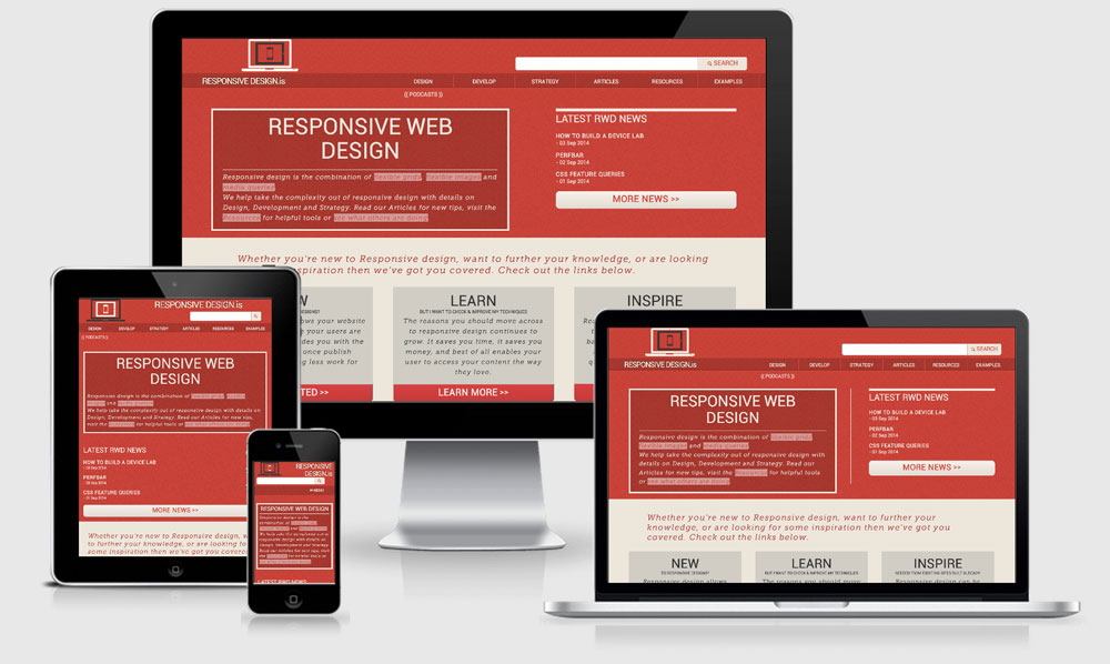
Am I Responsive is super simple, you enter a URL within the input and press go and it takes that URL and rewrites the src attribute of 4 iframes. Each iframe has a height a width attribute set to mimic a particular viewport, in this case 1600px, 1280px, 768px & 320px.
$(document).ready(function() {
// Change iFrame on a Button Click Event
    $(".button").click(function(event){
        $("iframe").attr('src', $( '#url' ).val());
    });
});
The div around the iframe uses a transparent png background-image of the particular device chrome (iMac, Macbook, iPad and iPhone), which then makes it appear as though the iframe site is appearing directly within the device. Of course at their full size the iframe‘s would never all fit not the screen let alone within the image screen space, so the CSS3 transform property is used to scale the size of the iframes to fit nicely within the ‘device’.
.laptop {
  background-image: url("../images/laptop-screen-optimised.png");
  width: 477px;
  height: 307px;
  top: 264px;
  left: 560px;
  position: absolute;
  z-index: 2;
  iframe {
    width: 1280px;
    height: 802px;
    top:26px;
    left:60px;
    transform: scale(0.277);
-webkit-transform: scale(0.277);
-o-transform: scale(0.277);
-ms-transform: scale(0.277);
-moz-transform: scale(0.277);
transform-origin: top left;
-webkit-transform-origin: top left;
-o-transform-origin: top left;
-ms-transform-origin: top left;
-moz-transform-origin: top left;
  }

}
By Friday afternoon I had it working at the most basic level and pushed it out to a few twitter friends. The first thing they came back with was that it wasn’t responsive, ironic isn’t it, and although it was primarily required for screenshots on the desktop it was kind of annoying me too. I made a few adjustments to the overall scale of the preview area as you move through the various viewports and made some simple changes to the form as well.
@media (max-width: 850px){
  .display{
    height: 500px;
  transform: scale(0.65);
  -webkit-transform: scale(0.65);
  -o-transform: scale(0.65);
  -ms-transform: scale(0.65);
  -moz-transform: scale(0.65);
}
.desktop{left: 100px;}
.laptop{left: 440px;}
.tablet{left: 0px;}
.mobile{left: 180px;}

}

@media (max-width: 768px){
  .display{
    height: 450px;
  transform: scale(0.55);
  -webkit-transform: scale(0.55);
  -o-transform: scale(0.55);
  -ms-transform: scale(0.55);
  -moz-transform: scale(0.55);
}
a.button {font-size: 1.6em; line-height: 1.75em; margin-top:0.5em; width:100%;}
input {height:1.2em; width:100%;}

}
Extending
Move me
Rather than have the same screenshots EVERY single time I wanted the ability to move them around the screen and change their z-index order. jQuery was already getting loaded to help with setting the iframe src (my javascript is terrible, so jQuery to the rescue) so I also included jQueryUI to allow the devices to the draggable. Again, there’s probably lighter/faster ways to achieve this with JS but I tested the load and it had a reasonable response.
<script src="//code.jquery.com/ui/1.10.0/jquery-ui.js">

<script>
$(document).ready(function() {
    var a = 3;
    $('.desktop,.laptop,.tablet,.mobile').draggable({
   start: function(event, ui) { $(this).css("z-index", a++); }
});
    $('.display div').click(function() {
        $(this).addClass('top').removeClass('bottom');
        $(this).siblings().removeClass('top').addClass('bottom');
        $(this).css("z-index", a++);

    });
});
</script>
Input + Enter
I noticed during my testing that I was occasionally hitting the enter key after typing in the URL instead of hitting the GO button. To fix that I started trying to find ways to hijack the return key to activate the button instead. Fortunately I had a bit of trouble trying to achieve that because it took me in another direction of trying to deal with ?url=http://yoursite.com as part of the url string.
I added a check to see if there was a URL variable and if so to load that into the <iframe src="". This provided the awesome benefit of being able to send someone a link that would load a specified site directly into the iframes. I think because of this the tool picked up a bit more traction in blogs and on twitter.
function getUrlVars() {
    var vars = {};
    var parts = window.location.href.replace(/[?&]+([^=&]+)=([^&]*)/gi, function(m,key,value) {
        vars[key] = value;
    });
    return vars;
}
var first = getUrlVars()["url"];
var first = decodeURIComponent(first);
var first = first.replace(/\#$/, '');

if(first === "undefined") {
  // don't do anything.
}
else {
//  take the url variable and update the iframes and input field
  $("iframe").attr('src',(first));
  $('#url').attr('value',(first));
}
Go, then enter – the hash #
With the added function of the URL variable I noticed that if you used the Go button first, and then used to the enter key (or visa versa) you would get a hash at the end of the url string which would shoot the preview to the top and interfere with the device previews. To fix this I added an extra check to remove # tag if it is found at the end of the url string. If it’s a legitimate anchor tag it will still work because it only removes the # from the very end of the string.
// this line achieves that and is part of the code already listed above
var first = first.replace(/\#$/, '');
Transparent Previews
I noticed a couple of sites people were posting didn’t have a background colour set. These were fairly basic information sites, but still it was bugging me. If you fail to declare a background-color: on your site it defaults to browser white, however because the iframes were sitting over a background image they were showing through in the site preview. This was quickly fixed by applying a background-color:#fff; to the iframes to hide what appears behind in the background images.
Feedback
I’m super excited/happy/humbled from how well received this tools has become. I’ve had help from people sending in bugs they’ve found and also sending through suggestions to improve the tool.
The feedback so far has been
- Add rotate to mobile and tablet
- Allow the ability to zoom into a device
- Enable the ability to change the background-color of the preview area
These are good suggestions, and I’ve even implemented the zoom capability locally allowing for a double click to zoom however it just doesn’t work that well in practice so I was reluctant to push it live. I need to think about how the UI would work for the other ideas as well, plus spend a bit of time trying to write the actual functionality.
I’m always keen to hear more about the things that could improve it, because after all it was built to help speed up my own workflow so the more it can help out others the better.
Some things to do/note
iPhone & iPad
Although I mentioned that I made this responsive I noticed that you don’t have any control over the height of the iFrame on these devices. The fix seems to be to add another div containing the iframe to set the viewable area of the iframe and hide the overflow.
@media max-device-width()
These media queries will not fire if your CSS is set up in this way. Unless you’re really really sure that you only want to trigger the query on a specific device my general advice would be to use min-width max-width and target the viewport rather than the device itself.
Non Responsive previews
If you’re previewing a non-responsive site you’ll probably notice that rather than zooming out so that the whole site fits in the viewport (which would happen on iPhone) it actually expands past the viewable area. I think this has to do with Mobile Safari including a faux viewport value if no value is found to improve how non responsive sites appear. Unfortunately it’s not possible (corrections?) to target the viewport meta of a site being shown through an iFrame.
Offline
With the local idea I thought about preparing presentations on trains, planes and automobiles. With that in mind there is now a cache manifest file added as well for those that want to take shots of local developments with not internet connection. Oh, and it made the page load even faster. Not sure if there’s any negatives to that though.
51 replies on “Building Am I Responsive”
[…] Das Tool „Am I Responsive?“ von Justin Avery gehört zu den intuitivsten Test-Tools, die es derzeit gibt. Nach Eingabe der URL spuckt die Seite das Layout in vier Größen aus: Desktop (1600 x 992 Pixel), Laptop (1280 x 802 Pixel), Tablet (768 x 1024 Pixel) und Mobile (320 x 480 Pixel. Die vier Devices, die euch als Apple-Geräte angezeigt werden, könnt ihr zudem bei Drag & Drop auf dem Bildschirm hin- und herschieben, eine nette kleine Spielerei. Wenn ihr euch übrigens für die Entstehungsgeschichte des Tools interessiert – die hat Avery hier aufgeschrieben . […]
I simply love this tool ! I wanted to add a snapshot of my responsive sites to my portfolio and this saved me a lot of time and it looks great too ! Great work. Thank you so much !
great tool…are there any licensing issues if I want to display websites on my website using the tool? so, I enter my website, take a screenshot and then add it into my portfolio….do I need to buy the image license for the devices? many thanks :)
No you’re fine, as long as you don’t charge for any of the screenshots you take it’s within the licence on the images/
great, thanks :)
This is a great tool. I have it bookmarked and find myself coming back
to it from time to time. One question… I haven’t been able to get a
preview for my rails sites. Any suggestion?
I would suggest it’s because you’ve got x-frame options set to deny and not allow anyone to iframe your site.
Duh! Thanks :)
Any plans on licensing this for use? Either as a plugin or as code? I would love a tool like this on my site?
It’s up there on Github if you would like to use it, feel free to reference the original site but it’s not requierd.
Thats awesome! Thank you
Would anybody out there be willing to explain how to do this to a total coding noob?
Or is it too complicated to do that in a simple message like this? It probably is, just asking anyway. I’d love to use it on my site, I’m just totally clueless.
Do you have a link to the download on GitHub?
https://github.com/justincavery/am-i-responsive/
Justin Avery, I just came across your tool, you are a genius! The timing for me to find it is just perfect. With this April 21 Google deadline, some people think they don’t need a responsive, or mobile website. Thank you for allowing us to use in our websites.
Awesome tool – thanks so much! Question though: I haven’t been able to get https://www.v2ratings.com/welcome to load – any ideas about that?
I’m guessing it’s going to be a X-FRAME OPTIONS problem.
Ah gotcha, guess there’s nothing to be done without server access then.
[…] working on a new website. You can learn about what framework and the making of the website here. Thanks to Trick2blogging.com for introducing me to this website. Posted in: Coding | Tagged: […]
Justin thank you so much for this site, I wanted to create some screen shots for my portfolio of websites I have created. This saved me so much time. Could I request two features, 1 a save button to save the current view as a PNG or JPEG in a higher res than a screen shot will allow. 2 a donate button so we can all thank you.
Oh I second this suggestion! I just discovered your tool and it’s going to come in so handy for me. It is helping me to simulate the responsive behavior of the website I am designing at the moment, but I, too, am looking to utilize this tool for adding photos of my projects in my online portfolio I plan to put together in the near future. Thank you for creating this and offering it for free!
Hi, for some reason my url wont load on amiresponsive, its a live website which loads in a browser and gets plenty of traffic, but is blank in this – any idea why?
I would say it’s because it’s either https or you have xframe options set to deny.
Great..Thank you very much.
Thanks bud, i’m about to use that as well. Very well done~!
Great article the best one yet however it didnt work for my website created with Frontpage 2002 platform
This would make a great WordPress plug-in, it’s a great tool and is bookmarked in my web tools.
Since you wrote this have you found one? I’m curious to know if there is a wordpress plugin that gives this functionality as some kind of embed?
I can’t get it to work with a site that has a dash in the URL.
Which URL are you using?
Usually it’s an x-frame same origin issue.
Hey,
this is amazing! I saw this a half year ago or so and I’ve used the tool a couple of times… The possibility of changing the bgcolor would be amazing!
Hi Justin, Thanks so much for your code, I’ve just implemented it on my website
Just a little question, is possible mute the audio? I’ll search and search, and search, and… you know right? but seems not possible to remove audio from iframes, neither with Java, php, or jquery, maybe you have a solution…
Opened a stackoverflow question where I am more specific http://stackoverflow.com/questions/37366933/am-i-responsive-mute-audio
I will try this on my site
rahasia cantik
Awesome, it goes without saying that. thank you for your important article post.
Would be nice if you could resize the preview part for bigger screenshots :)
Seriously… brilliant. Thanks for sharing Justin.
Thanks for sharing
what is this ?
thanks . v .mutch
kalabani.com
Very Bad Responive Checker
Thanks for the… kind words?
If you’re looking to check how your site responds you should, as the site says, use real devices.
Hi @shakeel, what issues have you found with this? I’m always looking to improve the tool if it will help.
Great tool, thanx.
Would this be possible to embed directly in a project showcae page ? and if it is how please ?
thank you
It is, but you’d need to implement it yourself. I always advise not to do this for these reasons
1) the site is live and will not always reflect the work you actually did
2) it will skew their analytics if your case studies page is popular
3) the tool literally loads 4 versions of the site in iframes. An image of this would be around 100kb, but the embedded tool would be 4 x the weight of the page being pulled in… not a good experience for your site visitors.
Hi Justin nice tool you have. I checked a client site I have been working on using the tool and it confirmed the responsiveness were okay on all devices however I noticed the site doesn’t scroll on all my mobile phones or mobile browsers except on a laptop or desktop.
For the sake of clarity the url is https://turbomaxoption.com/
Kindly assist look and advice. I have worked on the media queries in the css. the overflow property is scroll previously hidden.
Please advice. Thanks
Are you saying it isn’t scrolling on the Am I responsive site or on actual devices?
Great job. Would be nice if you could resize the preview part for bigger screenshots
Can you make a youtube tutorial on how to make this step by step? ????
Kudos! Kudos and more Kudos Justin Avery! I’m sharing your http://ami.responsivedesign.is/ website link on linked in. It’s a blessing to have found it. I refer clients to it often as it’s so very helpful. I haven’t had the time yet to make a portfolio but eventually I look forward to including your link and examples there.
Many thanks,
Malinda
Hi Justin, Thanks so much for your code, I’ve just implemented it on my website of vendertuweb