I came across this twitter account while going down a rabbit hole of linked tweets at 1am this morning.
The images are super simple but do a great job of supporting the content that go along with them, here are some examples below.
Constraint increases creativity

This is something that I tend to hear from some designers when I put a whole bunch of accessibility requirements/constraints onto them. The focus tends to be about what they are no longer able to do, rather than embracing what you can do and seeing how you can push it.
Process

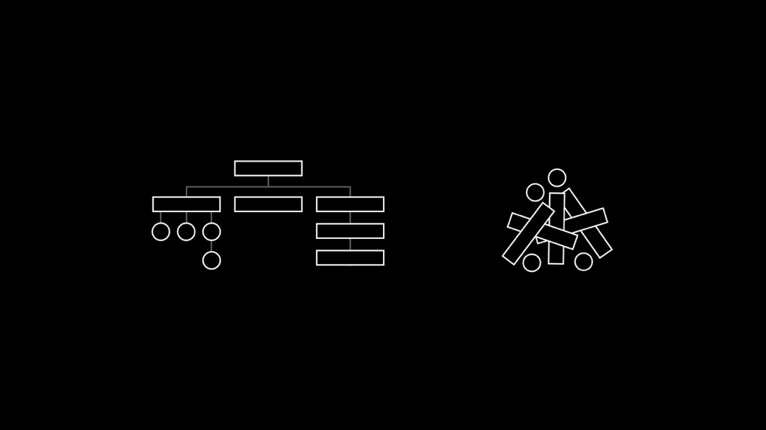
The right feels like the start of every discovery process that I do with clients, and fortunately most of them end up with the layout on the left.
Zoom out

The reason I was up at 1am was because I was also trying to regain access to buy some Crypto using Coinbase. Since lockdown I’ve not been having to put £300+ towards travel to get to the office each week. Instead, I’ve been investing that money into Plum, MoneyBox, and Coinbase.
As I’ve been slowly investing I’ve moved from being focussed on the hourly/daily changes in the price, and stressing about it FAR too much, and now I’ve managed to just let it work itself by setting up automatic deposits so that I get the dollar cost average.
Visualise Value
All of this stuff comes from the site https://www.visualizevalue.com which is jam packed full of amazing stuff.
