This was a personal project that we undertook over the course of 24 hours during an internet outage. I had just bought Ethan Marcotes’ A List Apart book about responsive design when the internet went out at home, and fortunately I had decided to rebuild my own personal site and this seemed like the most appropriate time.
Responsive design has taken the world by storm over the past 12 months as more and more devices are being released and browsers are adding more and more capabilities for CSS, and in particular the @media queries in CSS3.
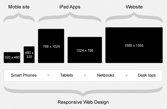
Responsive Design basically means that your site will change it’s design in response to the size of the screen/device that it is currently being viewed on.
It is a great opportunity to produce a custom and specifically targeted experience to your website visitors without having to maintain multiple websites for all the devices out there.
Desktop Size (1200px)

I wanted users to have a clear and easy experience while on their desktops and there wasn’t very much to update at this size.
There is the issue with Responsive Fluid Layouts when users have huge screens and stretch the browser across to 1600px. This causes a lot of your content to continue to be fluid and stretch beyond what would be deemed as a reasonable size.
The main container was centered and given a maximum width of 1200px so that once that reached it was only the white space either side of the centered container that continued to grow. To showcase that this was occurring a box shadow was added to the main container.
With this all sorted, I moved onto the next device width….. 1024px (or iPad Landscape)
iPad Landscape (1024px)

At this width there was still enough screen realestate to provide the two columns, however because I was designing with a hand held device in mind I decided to reduce the site container width to 1024px to remove any of the white space and removed the box shadow.
There was a width between 1200px and 1024px that caused “Justin Avery” and “Favourite Posts” to break onto two lines, so another rule was added to drop the size of those elements in between these two widths.
At this point images began to become a problem, so we set the css to display all images at 100% and control the size within the content through the figure element width.
iPad Portrait (768px)

I find that most people will use this for reading while on tube/plane/train or even in bed (if you’re lucky enough to be allowed to bring it in).
With this in mind most of the site becomes linear at this point with the side bar content being moved to below the regular, and more important, page content.
With the smaller screen I also increased the line spacing by half an em, and increased the overall body size by a few percent.
Rather than including the standard navigation, it was removed to include the standard click and drop down interface that users are used to with the portrait view on the iPad.
With more screen width for the sidebar (now that it was below the content) the About heading and text were increased. There was enough room to float the Favourite Posts and Media Types next to each other to take advantage of the additional room provided.
iPhone Portrait & Landscape (480px – 320px)

The design maintained most of the same features as the iPad portrait version except that the navigation made a triumphet return as the standard three options across the top of the site. This was done because as the screen size descreases the target size of your main clickable items should remain easy to touch.
To get more utilisation out of the smaller screen the article heading backgrounds were reduced and the padding between the heading and the date was greatly reduced. The font was reduced to an optimum reading size and the line spacing was returned to 1.6em
Favourite Posts and Media Types became linear however I found that the links were easier to read in two columns so the li width was set to 45% with some padding.
Overall this was probably my favourite sizes to work with because it is the most restrictive. On larger sites it’s even harder as it forces you to take a look at all the content on your home page and prioritise it because you can’t have two 1st position items in a linear site.
Conclusion
The design has been updated a few times since then, however you can see the original fixed width and the corresponding responsive design below.
If you want to know more about Responsive Design and whether it can help you, or if you want someone to update your site then we can do that for you.
4 replies on “Responsive Design”
Your post sounds fascinating.
Tweeted This Post ; )…
Thank you for the informative read….
Thanks so much – finally, the answer to my query! Really fab looking site by the way.
[…] The site changed over to a new design when responsive design first made it’s splash and I re-designed the site to be more responsive. […]