I’ve recently added HotJar to the Back Pocket Notebooks site to see how people are using the site. I was interested in where people were dropping off, how they were getting from the home page to the product page and where they might be getting distracted.
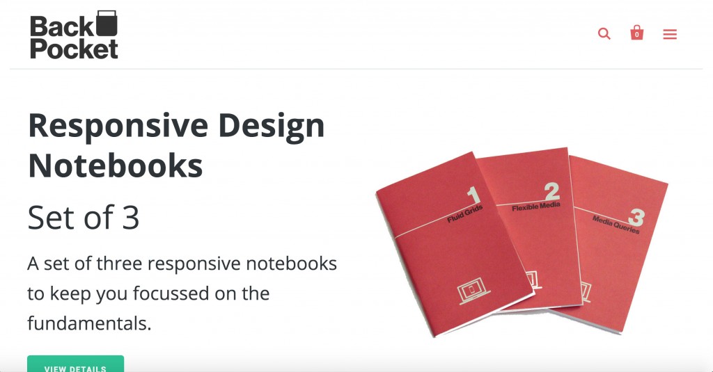
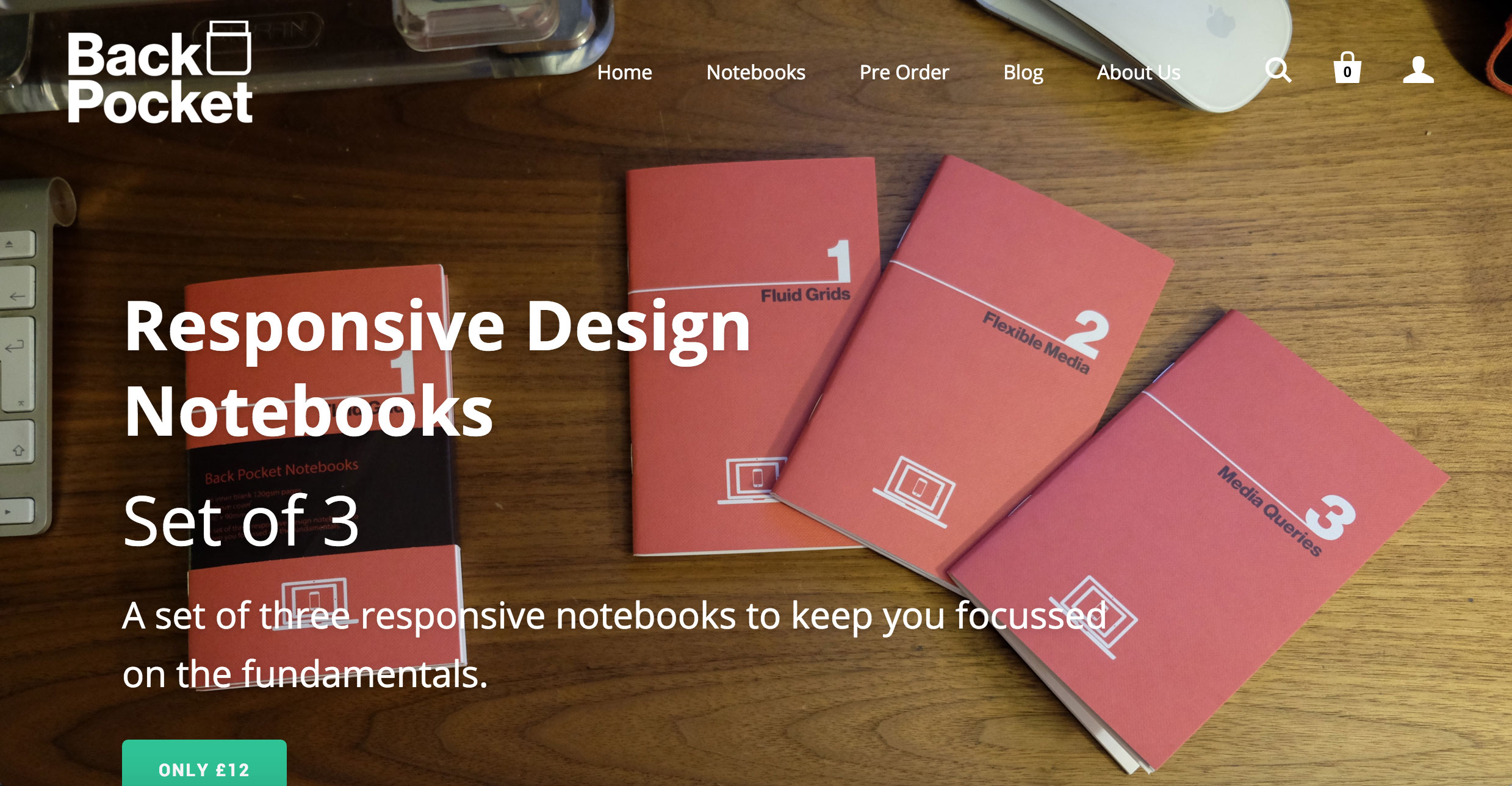
The more I looked into it the more I wanted to play around to see if a shift in the design would work. The template I’m using for the notebook store allows you for a hero feature, or to have a hero slide show. The slide show will allow you to run the image full bleed, where as the feature gets 50% for the images and 50% for the content.
By default I went with the smaller image to improve load times, and while sales are coming in regularly I wanted to see if the full bleed images that so many of my clients want to show off their products would tempt more people into adding the items to the cart and making the purchase.
Here’s the before image….

And here is the after image….

Any bets on how they’re going to go? Will there be more clicks? Will the slower performance (due to the larger images) of the site result in lower conversions?
I’ll touch back to announce the results in a few weeks.

2 replies on “Plain White vs Full Bleed Images”
Very interesting article, I have also added hotjar, must have seen the same add on Facebook.
I am testing to see whether single products or categories get better click throughs from the homepage
It would be interesting to see what the results are for you.