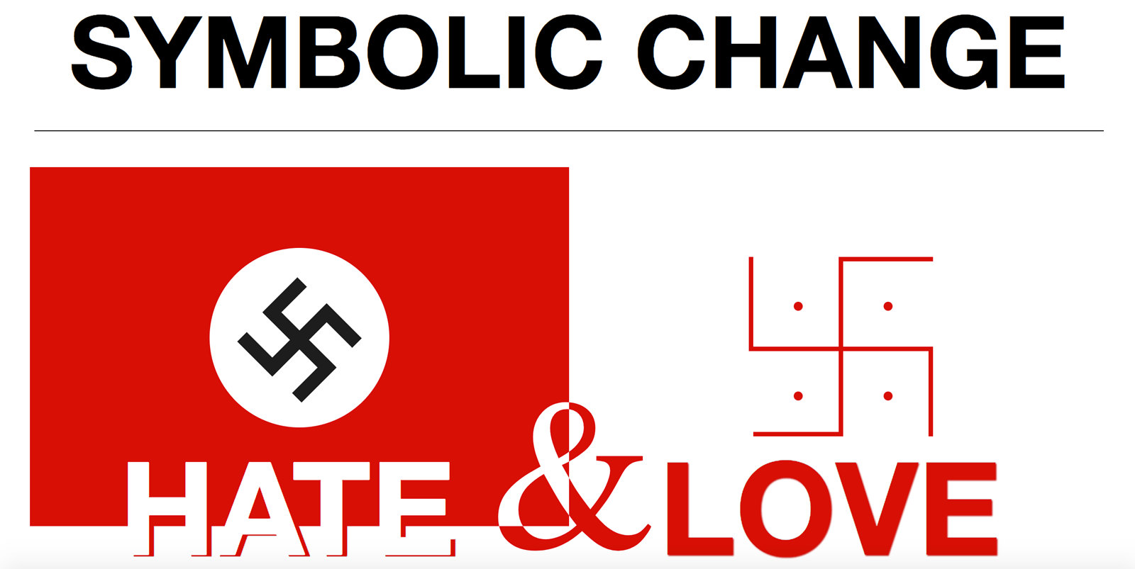
This was an CSS experiment after reading the Five Simple Steps book, Designing the invisible. The book was talking about the different meanings that symbols can take on in different cultures.
Over the past 3000 years the Swastika has gone from a spiritual symbol meaning love, change and wisdom and has been turned into one of the most recognised symbols of all time…. and for all the wrong reasons.
The images themselves are done completely with CSS and contains no images. The flag is just a large box with a red background, the white circle is using the border radius set to half the width of the container. The evil Swastika is done using the same methods, but adding a Transform to get the angles right. Stupidly I added the rotation transform to every one of the pieces instead of creating the symbol and applying the transition to the containing DIV. If I had of created the hindu swastika first then I would have realised this…. but I didn’t…. so I didn’t
Update: I did add an image in the because I wanted an ampersand in between the two items. I’m not sure if you can reverse the colours in the text just yet, so there’s the image.
Update 2: I took the ampersand image out and ended up doing it with CSS & HTML to keep in the theme. There’s one ampersand set to white in the red flag with the box set to overflow:hidden, and the red ampersand sits in the white flag. The overlapping occurs thanks to a bit of z-index magic.
See the Pen Love Vs Hate by Javery(@justincavery) on CodePen.
