One of the best things that WordPress did for the web was to roll out an automatic responsive images solution along with their out of the box installation and implementation of WordPress.
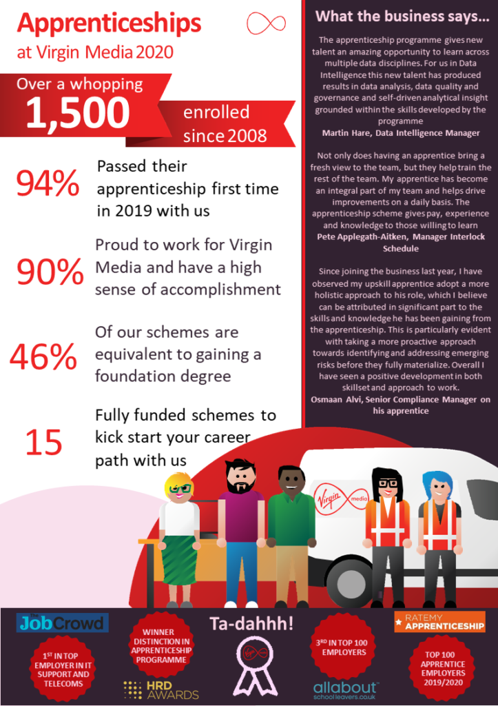
Below is an image which contains a lot of text, which from an accessibility point of view is terrible, but sometimes we need to incorporate things now that we then work towards improving (which is the case below).
The image size is 793 × 1123px, and when I upload that to WordPress it creates a few different iterations of that image at different sizes. These are
- Full Size — Slide1.png(the max size of the image)
- Large — Slide1-723×1024.png (preserve aspect ratio but make the largest size of the image 1024px)
- Medium — Slide1-768x1088px.png (preserve aspect ratio but make the width 768px)
- Small — Slide1-212×300.png (preserve aspect ratio but make the largest size of the image 300px)
The site then applies these different versions of the image as part of the SRCSET attribute on the IMG element. The format goes along the line of
Image URLWidth of imagew,
We end up with
srcset="Slide1-723x1024.png 723w,
Slide1-212x300.png 212w,
Slide1-768x1088.png 768w,
Slide1.png 793w"
Here you are telling the browser how wide the image is (the bit before the w), and where to retrieve that image from (the URL).
Here’s what it looks like put together.
<img
src="https://surfthedream.com.au/wp-content/uploads/2020/02/Slide1-723x1024.png"
alt="An image of apprenticeships at Virgin Media in 2020"
class="wp-image-2417" srcset="https://surfthedream.com.au/wp-content/uploads/2020/02/Slide1-723x1024.png 723w,
https://surfthedream.com.au/wp-content/uploads/2020/02/Slide1-212x300.png 212w,
https://surfthedream.com.au/wp-content/uploads/2020/02/Slide1-768x1088.png 768w,
https://surfthedream.com.au/wp-content/uploads/2020/02/Slide1.png 793w"
sizes="(max-width: 723px) 100vw, 723px" />
The great thing about this is that it just works. You don’t really need to know all the bits above, just that when you add an image into to WordPress you visitors are going to receive the best possible image for the device/browser that they’re currently using.