State of the Browser is a one day event that is put on by the London Web Standards team and it brings together evangelists and developers from browser vendors such as Internet Explorer, Firefox, Chrome, and Opera.
I was fortunate enough to sponsor the State of the Browser as well in way of free promotions as part of the Responsive Design Weekly newsletter and podcast
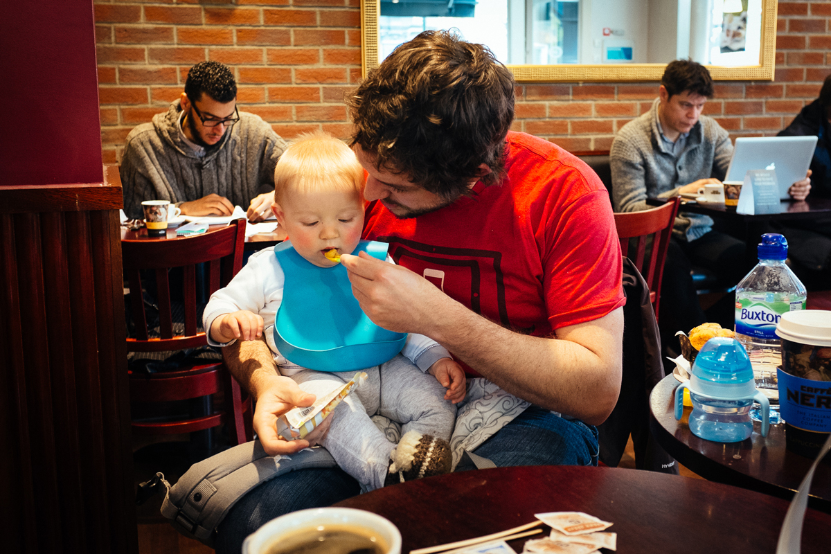
Conference Creche
Before I cover the talks I wanted to send a big shout out to the organisers for making me feel super welcome and the whole process of being there super easy.
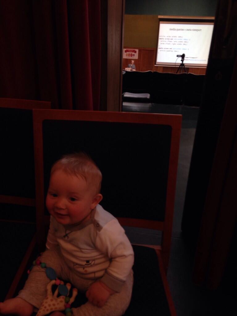
Laura was away for the weekend so I was taking care of Noah, which meant that he was literally strapped to me for much of the event. I must admit that while it seemed like a good idea to take him along (at 7 months old)…. as I was walking up to the venue I was a little nervous that it would create a scene and actually offend or interfere with other people that were attending the event.
Baby wear for conferences
For those of you that want to brave this as well this was what I managed to bring along with me.
- 3 or 4 toys (the less noisy the better. I had a soft rattle, a textured soft book, Sophie the Giraffe, and a chewable necklace)
- Food (2 bottles of cow & gate formula, 1 jar of ham leak baby foot, 1 squeezy pack of food… although I forgot to pack some cruskits or cucumber for Noah to gnaw)
- 4 nappies, nappy bags, wipes
- Phone (checking and posting tweets)
- iPad mini for taking some notes (not able to use this)
- bib
The Talks
Being in the gallows and having to leave early meant that it wasn’t possible to catch all of the talks or everything that was said during the talks I did manage to catch.
Here’s what I did catch and found interesting.
Microsoft – Martin Beebs
II was able to catch the first 25 minutes of Martins talk, which was great, before Noah woke up after lunch and wanted to have a chat (goo’s and gag’s again) about his dreams. This caused me to miss about 5 minutes in the middle of Martin’s talk…. surely to have been the best bits ;)
Martin was talking about the f12 developer tools that have appeared within the later versions of IE. Unfortunately I run a mac these days so I haven’t seen IE for a while, but I must say many of the screenshots of the IE developer tools that Matin alluded to looked amazing, far better than you currently see on the latest version of Chrome.
Martin talked about the performance of IE vs it’s competitors, and also how they rely mostly upon processing requests on the GPU rather than the CPU for performance benefits. Martin was also quick to point out that positive was a direct result of Microsoft only providing IE on Windows machines so they didn’t face the same challenges of performing across multiple platforms in the same way that Chrome and Firefox face.
Martin also talked about the general poor performance that PNG has in comparison with JPG. Sure you can sometimes get a PNG file size down a little less than an JPG but the processing time can also negate the time saved on the download. If you’ve got an image rich site then it’s well worth checking this further and considering covering your images back across to progressive jpgs.
Jake Archibald?
Jakes talk was magnificent, at least from what I was able to see. A very entertaining talk, it was like a really intelligent and informative stand up routine.
Jake talked about using web workers to approach websites from a offline first approach. He shy’s away from the use of AppCache citing the famous philosopher Andre the Giant.
“I don’t like to speak bady of people. I have grown up thinking and being told that if you cannot say something nice about someone, you should not say anything at all. But I must break that rule in this case beacuse I hate Hulk Hogan very much. He is a big ugly goon and I want to squash his face”
App cache is Hulk Hogan.
Unfortunately Noah was a little more playful during this session and I missed the crux of the talk, but here’s how I would like to see an Offline First website approach.
It would be awesome if we could chose a website, lets say BBC.co.uk, and decide the sections of the website that we were most interested in. For me this would be the Sports section — in particular Football, Cricket and F1.
These sections contain a series of articles that are updated throughout the day and served as HTML to the website. This same content could also be served via JSON. My thoughts on the process would be
1. Check if a network connection is available (you would set what kind of connection is required for the downloading of content, is it wifi, 3g, 4g etc)
2. If a connection is available, check to see if the current JSON file matches the remote server file.
3. If the files are different, perform a diff and retrieve only the updates to the JSON file.
4. Repeat every n minutes.
This would also need to specify the maximum bandwidth allowed to be used over a specified time period as well as an option to download and store images (which would increase the bandwidth usage).
With content retrieved it’s a matter of accessing the page on your mobile device.
- Visit the website while offline.
- Local Storage provides the fallback HTML frame required to display the json content.
- The frame is filled with the JSON content that was previously pulled down.
- Read your articles offline.
I’m sure there’s a tonne of things that are taken for granted with this approach, but from a website serving content via a CMS it’s not too much of a stretch to make your content available via this method — the difficulty is on the browser and device side of things.
Unfortunately Jake’s talk won’t be available on video for a little while yet because he’s going to be delivering it as part of Google IO, but once it’s up I’ll post a link to it here.
Yoav Weiss
Yoav is a freelance developer that specialises in browser development. He’s been a part of the Responsive Images Community Group (RICG) working towards trying to find a solution for — you guessed it — Responsive Images.
After many many hours discussing this online and at meetups we have a solution in the way of the <picture> element and src-set.
This provides solutions to all the use cases:
- Serve only a single image
- Provide art direction capabilities
- Serve different images based on viewport width/height and pixel density
- Provide a suitable fallback for browsers that do not support
Scott Jehl from the Filament Group has already created a Polyfill so that you can start using the new picture syntax in your projects today and, best of all, it might not be that long until your able to use it without the PolyFill.
The folks over at Modernizer have included this as one of the feature checks so including the polyfill can be done intelligently as well.
There’s so much to go through with the picture element I’m just going to point you to this weeks podcast with the chair of the RICG — Mat Marquis.